Brendan Harrison
User experience, writing and content strategy.
FAQ redesign and rewrite
Problem
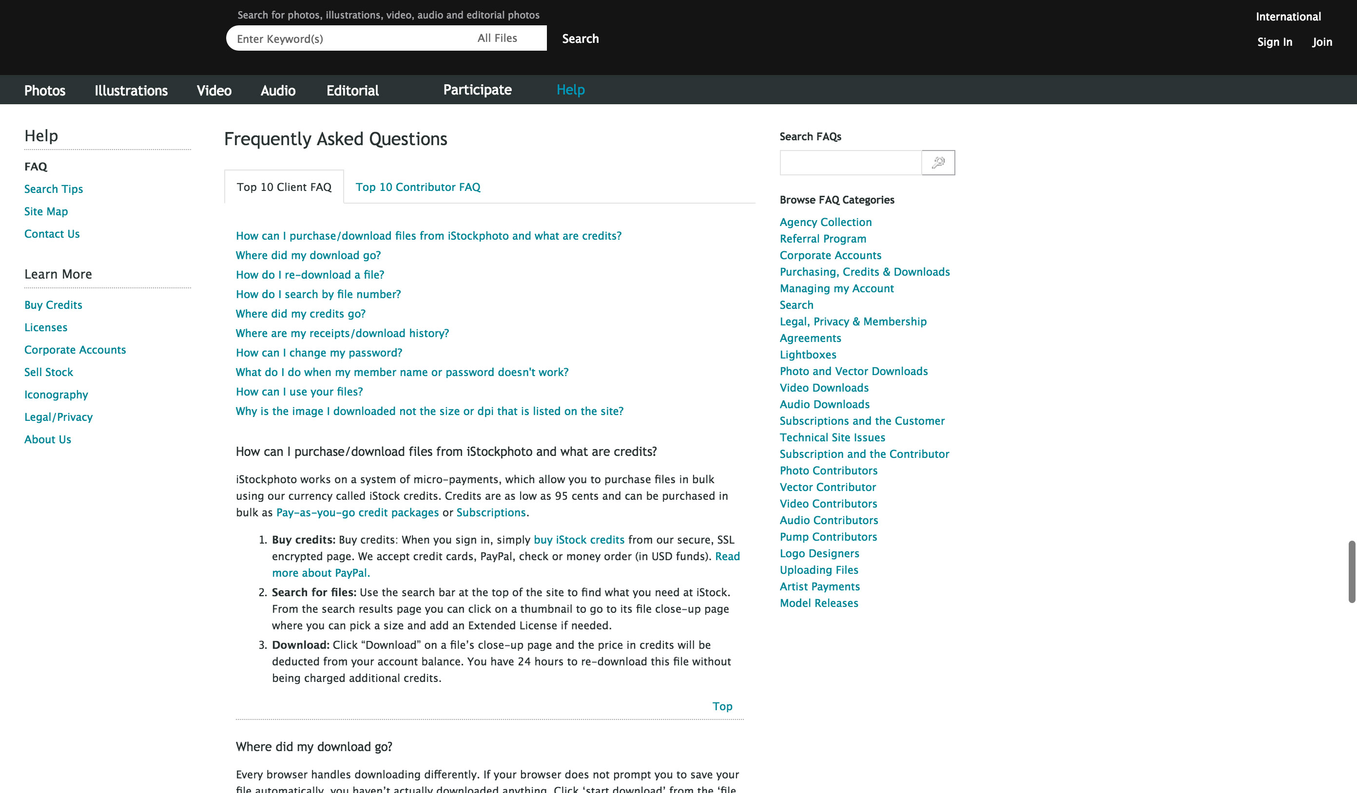
When I started at iStock, our FAQs were a shambles (see image below). Information was outdated, search didn't work and questions were hidden behind 24 distinct categories. Although we knew users who came to these pages were already frustrated, we made it worse by making them dig to find what they were looking for.

Process
To help fix the architecture, I reached out to our analytics team to get reports on which questions our users were interacting with. I used this data to inform a card sort exercise conducted with our customer service team to group the highly-used questions in ways that made sense to them.
Product
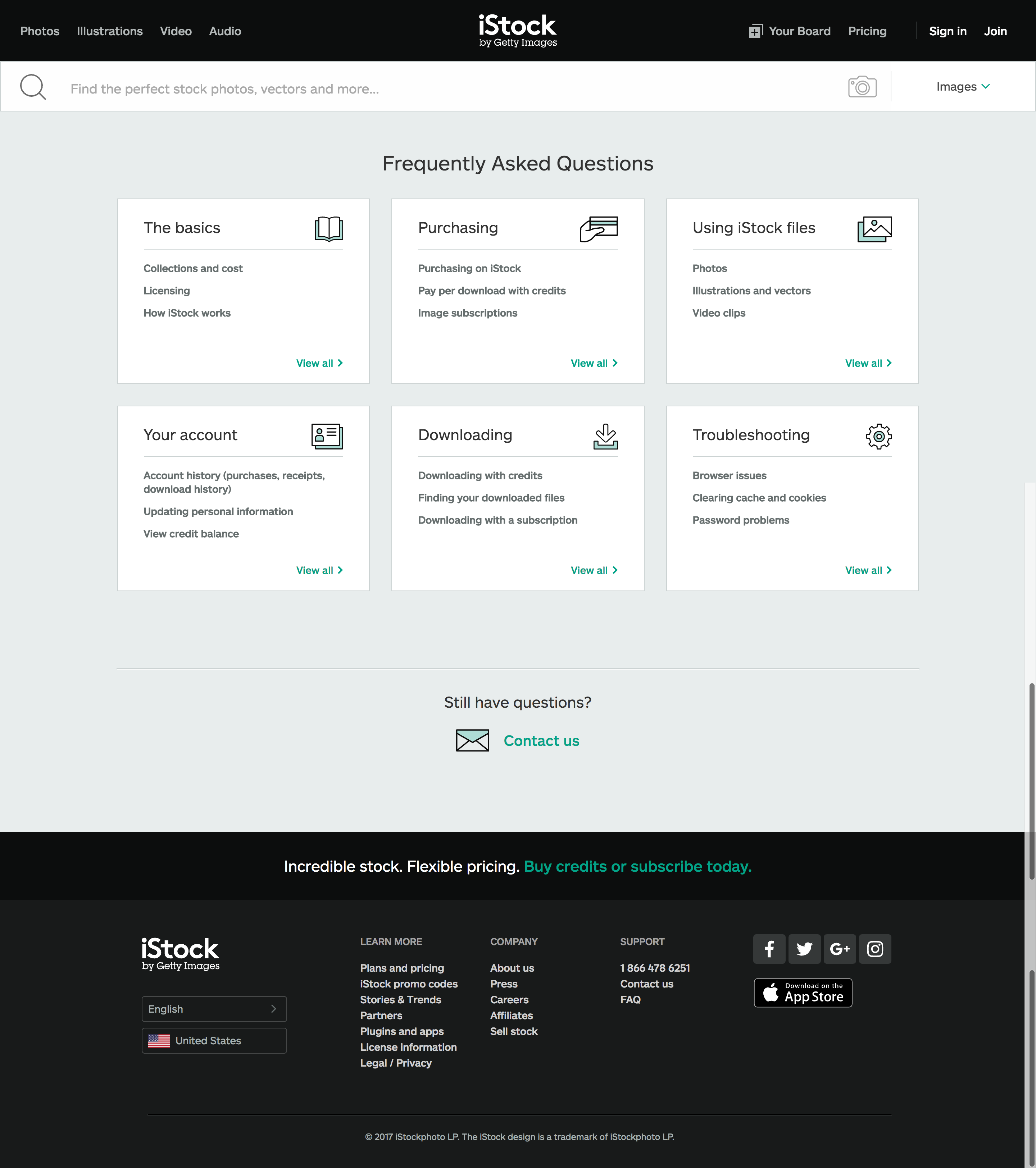
By scrapping more than 80 low-value FAQs, I was able to rewrite the remainder to reflect our current UI and the evolution of our tone and voice. We were also able to implement a design that allowed us to surface the top issues under each category to make it easier for users to find the information they need. These improvements resulted in a decrease in call volume and support tickets for our customer service team, allowing them to focus their energy on more important problems.
