Brendan Harrison
User experience, writing and content strategy.
Updated license help page
Problem
Despite being in the business of licensing stock photos, we at iStock did a poor job of explaining exactly what that meant. And while I'd like to say that changed when I joined the team, that's not entirely true. I didn't even realize how bad it was until we conducted a usability study with first time purchasers and asked them what license they needed to put an image on a t-shirt.
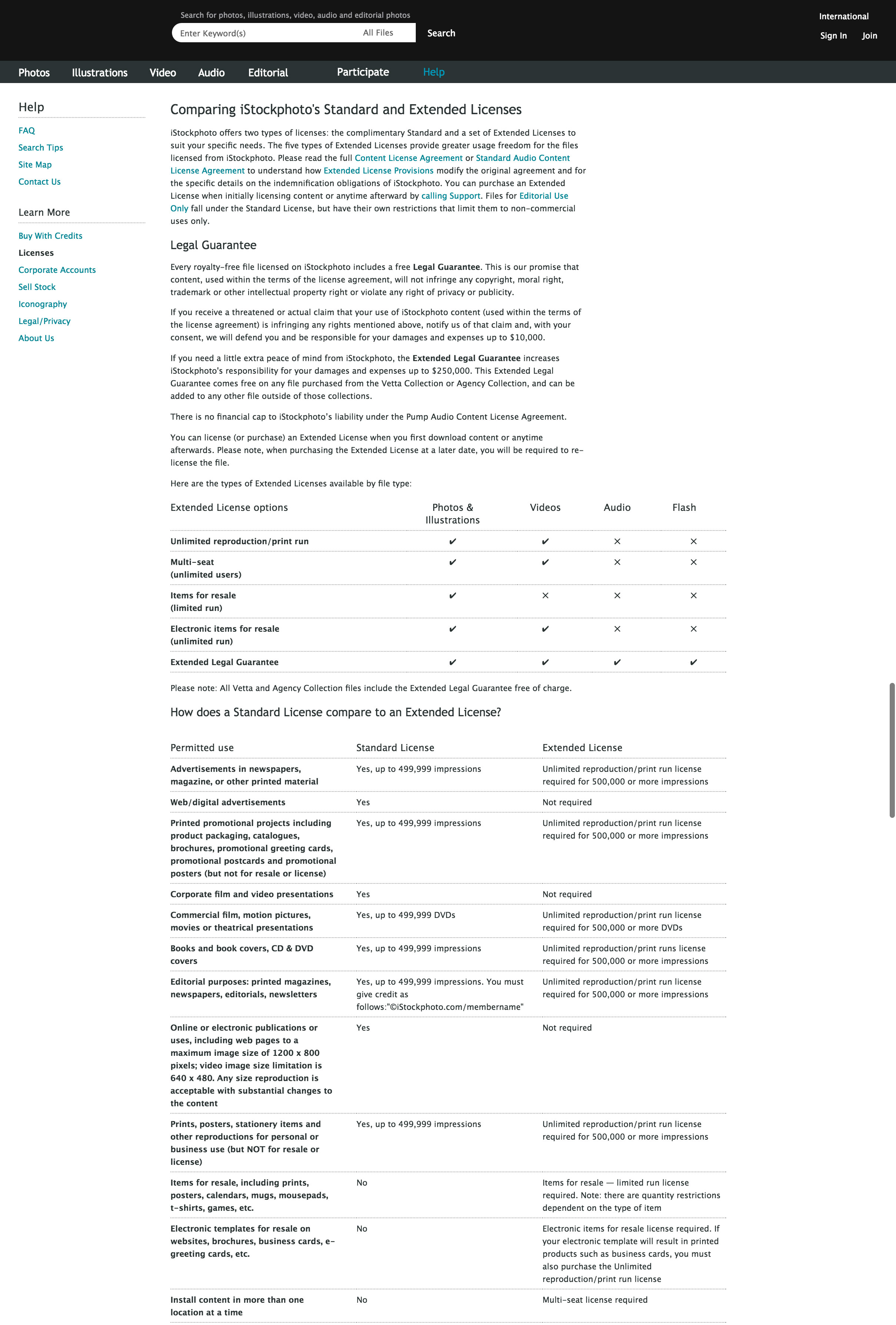
It will probably not surprise you to learn that users who consulted the page below had difficulty answering that question. In fact, when we pulled analytics, it turned out that users who came to it were 6 times more likely to call us for help than those who didn't see it.

Process
We worked with customer service and user research to look at what information would help users understand which license they needed for their particular project.
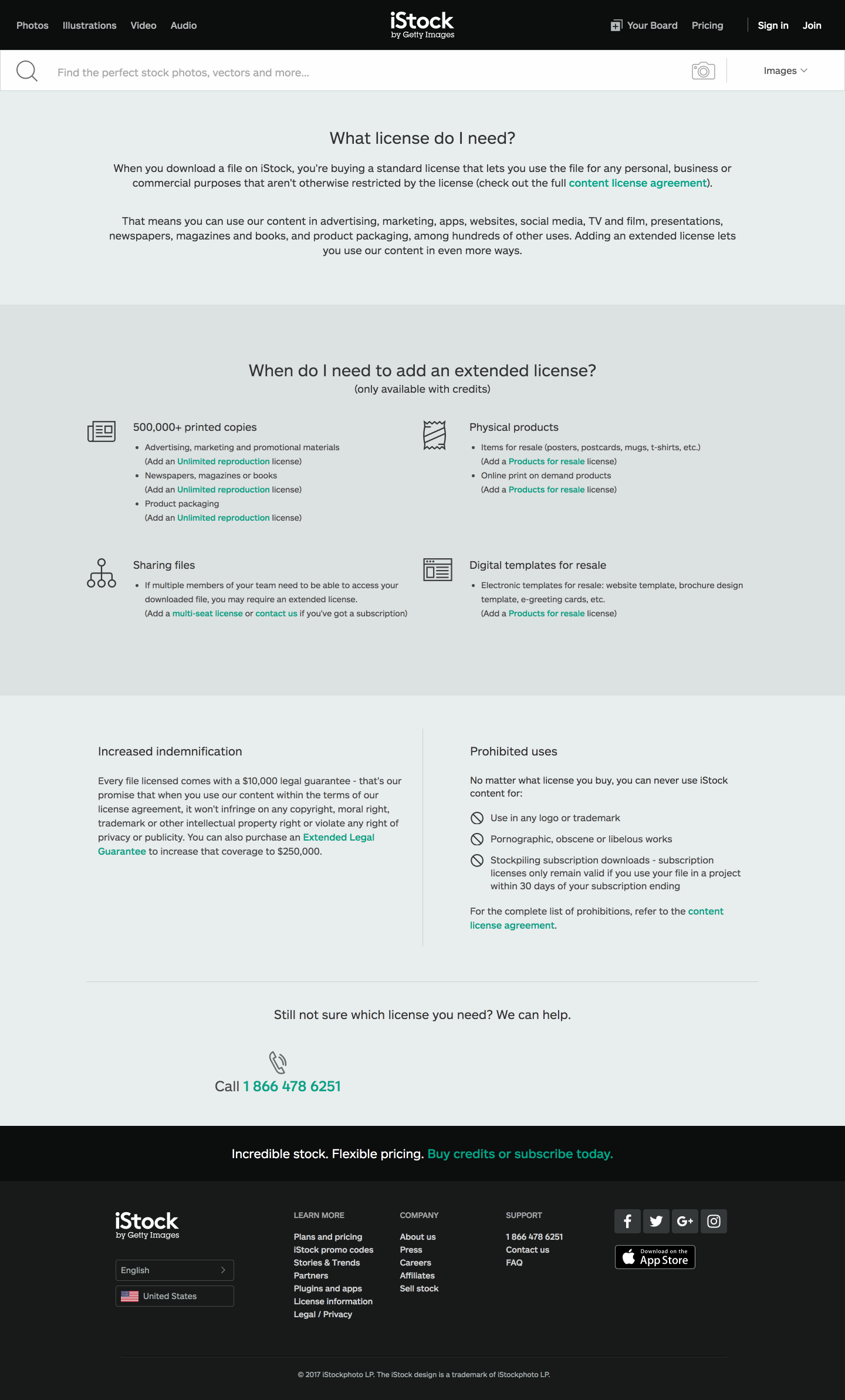
We created clickable prototypes and iterated on our designs. Our initial approach was to list all of the ways you could use our license, but this ended up confusing our users if they didn’t see their exact use case. Our ultimate approach was quite different from where we started off.
Product
It turned out that our standard license was so comprehensive that it was more helpful to outline the limited number of uses that required extended licenses and simply list out the handful of prohibited uses. By distilling down to this level, we saw call volume around licensing decrease by half.
